
Comparative study between 1570 edition par Bartoloméo Faletti and a 1573 Plantin one

Within the perspective to analyse parts of the work of Christopher Plantin as a printer, we are going now to make a small comparative study with the materials that we have at our disposition. The website project of the Edizioni Italiane del XVI Secolo[1] published two scanned photographs of the title page and the colophon of the Missale Romanum edited by Bartoloméo Faletti in 1570. Meanwhile, it turned out that the Google project launched during the writing of the present work the digitized versions of several editions of Missals made by Christophe Plantin, including another copy of the Missal from 1573[2]. Hence, we judged that the comparison of the two titlepages could represent a micro case study of the differences present in their choices in the printing process, along with all this in a context of evolution for typography. In fact, the purpose here is to demonstrate how Christophe Plantin was already in the trend of the barely born modern book.
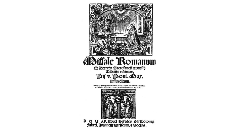
First, let’s begin with the work of the Roman printer Faletti [see appendice]. The very top of the title page was made with an impressive engraving that takes almost half of the support in its length. Then, the first words were printed gradually with a large Missale Romanum followed by a smaller Ex decreto sacrosancti concilii tridentini restitutum. All of this constituted the entire official title of the liturgical book. Below was next put the holy name of the conceptor that was at the origin of the undertaking: Pii V. Pont. [ificus] Max. [imus] iussueditum that we could translate as “ordered by saint Pius V”. This part of the text was printed in a gothic typography, very common during the period. During the born of typography, the latter was a unique art form, that would quickly develop and reach the peaks of excellence. Indeed, gothic characters was the most employed, and everywhere from Northern to Southern Europe.[3] The historians have distinguished different categories of typography over the periods[4]. In the present case of 1570, the essential of the main part of the titlepage seems as it was made from the lettre de somme, a variant of an Italian Gothic that spread widely in Europe[5]. Also named rotunda, the round gothic, was very used in the Italian peninsula. Recognisable thanks to its rounded edges on the upper part of the “a”, by comparing with the models proposed by the online exposition from Part-Dieu Library of Lyon, we assume to believe it was the lettre de somme that were printed[6]. The next part of the title page of the Missal is a sentence testifying from the privilege obtained by the printer from pope Pius V and King Philipp II. This latter part has the specificity to be the only one to have a typography with roman characters. The exact paternity in the categories of roman typography is difficult to establish. However, the history of its evolution was established with the printers Sweynneym and Pannartz from Mayence who settled in Subiaco, next to Rome, along with Jean and Wendelin from Spire and settled in Venice that composed the first roman characters. It was in 1470 that French printer Nicolas Jenson improved this typography with a round shape. Later, Alde Manuce would work again the characters with Francesco Griffo[7]. Then, it was under the influence of the Italian printer, Claude Garamont would create for the printer Henri Etiennes from Lyon, a “balanced roman which was widely distributed and used throughout Europe until the French Revolution.”[8] Another engraving follows the privilege, but seeing its size and its component, -two saints represented under a double-arch- it does look to be a typographical mark. The special kind of engravings that are typographical marks, or printer’s mark, were more known for their representation of objects, symbols, accompanied with the printer’s motto. Following the example of Christophe Plantin, his one was made of a hand holding a compass, all within an oval frame indicating the words labore et constantia. In the case of the Faletti edition, the typographic mark was found in the colophon. It showed a crowned syren holding its two tails by the hands. Within the context of absence of a proper bibliographical reference to check the information, the CERL Thesaurus online project[9] enabled to confirm the idea. Indeed, the authority notice about the printer brought the confirmation that the picture of syren began to be used from 1570, the year of Faletti’s passing. At the bottom of the page, we can find the inscription: ROMAE. Apud heredes Bartholomei Faletti, Johannem Uariscum et scios ; which probably meant that the book was produced in Rome, by the heirs of Bartoloméo Faletti and Giovanni Varisco and partners.
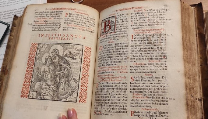
The piece of work designed by Christophe Plantin is quite different on many aspects. In comparison, the title page made by the Antwerp based printer brought a general clear view on its content. In the first place, the typographic choice was made with a full page of roman characters, probably coming from the dies and punches of Garamont, like what we previously saw in the inside. The title was printed in capital letters, with a bright red, and was placed to take the main part of the upper page. The rest of it, from again the paternity of Pius V in the publication of the Tridentine Missal was also designed in red. We can deduce that the systematic presence of his name in both Missals was ordered to be standardized this way: he was the one that represented God on Earth and the institution’s supreme authority through the book. We could read: IUSSU EDITUM; which could mean “published by order”. As a result, it is not surprising that the liturgical book was nicknamed over time “the Missal of Pius V”[10]. Next, the engraving in the centre of the page attributed to, two Flemish engravers that regularly worked with Plantin. Only the information about the publication is left: the city again in red, the name of the printer, as well as the Latin mention architypographi, also written prototypographus regii in other editions. Indeed, we should know that in the same year 1570, Christophe Plantin was appointed architypographe to his majesty Philip II. We have seen that the various editions digitised by Google from 1571 to 1577 all have this layout, including colour. The whole gives a harmonious result, more airy and visually more aesthetic than its competitor the heirs of Faletti and Varisco.
About the content of a Missal
References of the materials
Missale et Breviarium 1572-1576. (n.d.). [Archival unity]. ARCH.122. Plantin-Moretus Museum.
Missale Romanum, ex decreto sacrosancti concilii Tridentini restitutum, Pii V pont. max. jussu editum. (1570). Apud heredes Bartholomei Faletti, Joannem Variscum, & socios. https://edit16.iccu.sbn.it/resultset-titoli/-/titoli/detail/11610
Missale Romanum, ex decreto sacrosancti concilii Tridentini restitutum, Pii V pont. max. jussu editum. (1573a). ex officina Christophori Plantini; Plantin-Moretus Museum. https://books.google.fr/books?id=Lb8wm7_TshEC&hl=fr&source=gbs_navlinks_s
Missale Romanum, ex decreto sacrosancti concilii Tridentini restitutum, Pii V pont. max. jussu editum. (1573b). ex officina Christophori Plantini; Plantin-Moretus Museum.
[1] ICCU. (n.d.). Title search results – EDIT16 – OPAC SBN. Edizioni Italiane Del XVI Secolo. Retrieved August 22, 2022, from https://edit16.iccu.sbn.it/resultset-titoli/-/titoli/detail/11610
[2] Missale Romanum, ex decreto sacrosancti concilii Tridentini restitutum, Pii V pont. max. jussu editum. (1573). ex officina Christophori Plantini; Plantin-Moretus Museum. Note: referenced as R 54 26 at the Plantin-Moretus Museum. https://books.google.fr/books?id=Lb8wm7_TshEC&hl=fr&source=gbs_navlinks_s
[3] Audin, M. (1972). Histoire de l’imprimerie, Radioscopie d’une ère : de Gutenberg à l’informatique. A. & J. Picard. p.107
[4] Ibid. p.107
[5] Ibid. p.108
[6] Part-Dieu Library of Lyon. (2016, September 30). Du modèle manuscrit au modèle imprimé : la typographie. Impressions premières. La page en révolution de Gutenberg à 1530. [Exposition]. Consulted on August 15, 2022, at the address: https://www.bm-lyon.fr/expositions-en-ligne/impressions-premieres/
[7] Audin, M. (1972). Histoire de l’imprimerie, Radioscopie d’une ère : de Gutenberg à l’informatique. A. & J. Picard. p.109
[8] Part-Dieu Library of Lyon. (2016, September 30). Du modèle manuscrit au modèle imprimé : la typographie. Impressions premières. La page en révolution de Gutenberg à 1530. [Exposition]. Consulted on August 15, 2022, at the address: https://www.bm-lyon.fr/expositions-en-ligne/impressions-premieres/
[9] Site CERL Thesaurus.
[10] SENEZE, N. (2007, February 16). Messe de “saint Pie V”, messe de Paul VI. La Croix. https://www.la-croix.com/Religion/Actualite/Messe-de-saint-Pie-V-messe-de-Paul-VI-_NG_-2007-02-16-519922